Aarrr Matey; AHL Admirals Announce Ye New Logo!

Want to discuss any hockey related issues? Heard some interesting news? Watched a great game? Heard an interesting rumor or quote? Talk about it here! CONTAINS SPOILERS!
Post Reply
User avatar
Minstrel
TBL Admin Team
Posts: 6527
Joined: Wed Aug 03, 2005 11:17 am
Custom Rank: Minty
Favourite Team: Chicago Blackhawks
Location: Chicago, Illinois

Aarrr Matey; AHL Admirals Announce Ye New Logo!

Post by Minstrel »

:-p

http://www.milwaukeeadmirals.com/home/news/new-logo0

Image

It comes along with one of the more detailed re-invention "stories" since McFarlane redesigned the Oilers 3rd jersey. I'm not saying it's good but hey kudos on creating a backstory for a logo and color change guys :chuckle:
The logo and slogan come with quite an interesting story that traces the origin of the new logo, which, as it turns out isn’t new at all.

The Admirals new logo is actually and aged version of the team’s logo from the late 1970’s, a short young lad, who was lost in the waters of Lake Michigan back after the 1981 season and was recently found. The only thing that managed to keep him alive all these years was his fighting spirit. In fact, after one of his legs fell off, he used it as a hockey stick to hone his skills.

After over 25 years of being underwater, the red white and blue uniform had faded to the black, silver, and ice blue, and had turned his fresh young face into a skull. Despite all of his changes, his fighting spirit never wavered and that relentless spirit and tireless work ethic have given us our new battle cry: Never Say Die!
User avatar
Systemfel
Leading Scorer
Posts: 817
Joined: Sun Mar 20, 2005 5:56 pm
Location: Sweden

Post by Systemfel »

Wow, that logo SUCKS. Terrible, IMO.
User avatar
E5150_ca
All-Star
Posts: 1013
Joined: Fri Nov 04, 2005 2:56 am
Custom Rank: PrO Canada!
Location: Toronto

Post by E5150_ca »

Richard and I love it.
User avatar
Minstrel
TBL Admin Team
Posts: 6527
Joined: Wed Aug 03, 2005 11:17 am
Custom Rank: Minty
Favourite Team: Chicago Blackhawks
Location: Chicago, Illinois

Post by Minstrel »

I'm not too fond of it myself, but I think the other versions of it are even worse....

If you look at the 'full version' on their header for example:

Image

Uhh... yeah... it's all just about 50 different kinds of out of proportion and off kilter it seems... you can by the way catch an amaimated with flash and a booming "announcer voice" version of the text I quoted at their website: http://www.milwaukeeadmirals.com/
User avatar
inSTAALed
Stanley Cup Winner
Posts: 1443
Joined: Tue Jan 31, 2006 10:51 pm
Custom Rank: Back From The Dead
Location: Raleigh, NC

Post by inSTAALed »

Are you sure that isn't for a peewee team?
User avatar
Minstrel
TBL Admin Team
Posts: 6527
Joined: Wed Aug 03, 2005 11:17 am
Custom Rank: Minty
Favourite Team: Chicago Blackhawks
Location: Chicago, Illinois

Post by Minstrel »

:-p

On a totally unrelated note; I've always found it extremely odd that one league has two teams named the Admirals; AHL's Norfolk is also the Admirals, they're the Hawks main affil.
User avatar
Alex the Tall
Minor League
Posts: 276
Joined: Wed Aug 09, 2006 2:12 pm
Location: Montréal, Québec, Canada

Post by Alex the Tall »

Seriously what's happening whit the logo of the hockey teams. They new logos always sucks and they try to make them look like cartoons logos.
User avatar
inSTAALed
Stanley Cup Winner
Posts: 1443
Joined: Tue Jan 31, 2006 10:51 pm
Custom Rank: Back From The Dead
Location: Raleigh, NC

Post by inSTAALed »

I think that's because a cartoonist designed that one :-D
User avatar
flea
Team Captain
Posts: 932
Joined: Mon Feb 13, 2006 6:39 am
Custom Rank: NASCAR Racer!
Location: A Coruña, Spain
Contact:

Post by flea »

Ufffff....its awful!!!!!

Poor Admiral fans....I cant imagine me buying a jersey with that logo on :-D
User avatar
Devils88
Second Line
Posts: 618
Joined: Thu Jul 08, 2004 6:35 pm
Custom Rank: Resident Cardsmith
Favourite Team: New Jersey Devils
Location: Austria

Post by Devils88 »

](*,) :sgt: :nuts:

oh no...can't believe that someone got money for designing this. i like south park style, but not for a hockey logo.
this is really awful....
also the "new" ducks logo hurts my eyes. very creative - writing ducks - and use it as logo :dunno:

but also my devils organization did a "not so good" logo this year.
Ex-Lowell Lock Monsters are now the Lowell Devils. logo doesn't stun me at all....

Image
User avatar
Minstrel
TBL Admin Team
Posts: 6527
Joined: Wed Aug 03, 2005 11:17 am
Custom Rank: Minty
Favourite Team: Chicago Blackhawks
Location: Chicago, Illinois

Post by Minstrel »

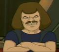
Yeah I mentioned the Lowell change in another thread too ;) However really anything for them would have been an improvement as they had a cartoon-based logo that looked like something out of a 70s kids cartoon show :roll:
User avatar
joehelmer
TBL Mod Team
Posts: 3483
Joined: Tue Jan 25, 2005 4:45 pm
Favourite Team: Djurgården (SHL)
Location: Sweden

Post by joehelmer »

I like the Lowell logo more than this one. This must be one of the ugliest logos right now....
User avatar
archibalduk
TBL Admin Team
Posts: 20372
Joined: Tue Jul 06, 2004 8:44 pm
Custom Rank: Seaside + Fruit Juice Mode
Favourite Team: Guildford (EPL) / Invicta (NIHL)
Location: United Kingdom
Contact:

Post by archibalduk »

Heh I like the logo of the Admiral in the banner (where he's about to hit the puck). It cracks me up :D

I'm gutted about Lowell changing their name. I loved "Lowell Loch Monsters"; but not as much as Long Beach Ice Dogs 8-)
User avatar
Minstrel
TBL Admin Team
Posts: 6527
Joined: Wed Aug 03, 2005 11:17 am
Custom Rank: Minty
Favourite Team: Chicago Blackhawks
Location: Chicago, Illinois

Post by Minstrel »

Strangely enough after seeing the new Admirals (Milwaukee) Logo I thought for sure their 'dark' jerseys woould be black and blue right?? :dunno:

Nope!! They're grey! :roll: Man what a blind-leading-the-blind project this whole 'remake' was...
User avatar
Systemfel
Leading Scorer
Posts: 817
Joined: Sun Mar 20, 2005 5:56 pm
Location: Sweden

Post by Systemfel »

That jersey sucks more than the logo.
User avatar
oxenhoper
Minor League
Posts: 288
Joined: Wed Sep 13, 2006 6:32 pm
Location: Oxenhope, West Yorks.

Post by oxenhoper »

Aint rebranding great........... :roll:
User avatar
inSTAALed
Stanley Cup Winner
Posts: 1443
Joined: Tue Jan 31, 2006 10:51 pm
Custom Rank: Back From The Dead
Location: Raleigh, NC

Post by inSTAALed »

oxenhoper wrote:Aint rebranding great........... :roll:
Uh... No. :-D
User avatar
Minstrel
TBL Admin Team
Posts: 6527
Joined: Wed Aug 03, 2005 11:17 am
Custom Rank: Minty
Favourite Team: Chicago Blackhawks
Location: Chicago, Illinois

Post by Minstrel »

This is really a case of 'What Not To Do' id "rebranding" your team; I think they've basically gotten everything wrong every step of the way here... I'd be really embarrased if I lived in Milwaukee but since in fact Milwaukee is quite close to Chicago we have a bit of a rivalry and so I laugh heartily in their direction and say "Yeah, that's just classic Milwaukee... :roll: "
Post Reply