TBL's Official New Uniforms and Logos thread
-
Saranis

- Top Prospect
- Posts: 128
- Joined: Sat Jul 28, 2007 5:14 pm
-
Saranis
- Top Prospect
- Posts: 128
- Joined: Sat Jul 28, 2007 5:14 pm
http://www.fathead.com/nhl/vancouver-ca ... ucks-logo/
I've been seeing this logo all over the place recently. All I can say is Ew.
I've been seeing this logo all over the place recently. All I can say is Ew.
-
CatchUp

- TBL Mod Team
- Posts: 1879
- Joined: Sun Dec 10, 2006 9:01 pm
- Custom Rank: CEO Of Avatars Inc.
- Location: Toronto, ON
Sadly, that is the logo I've seen kicked around the most as well. Usually paired with this mess:
http://members.shaw.ca/pfizer3/rbk_nux_pfizer_white.jpg

Blech.
Now this, this is slick:
http://bp0.blogger.com/_r8tWGVHrjGI/RqD ... _id_02.jpg
Johnny Canuck!
http://members.shaw.ca/pfizer3/rbk_nux_pfizer_white.jpg
Blech.
Now this, this is slick:
http://bp0.blogger.com/_r8tWGVHrjGI/RqD ... _id_02.jpg
Johnny Canuck!
-
bruins72

- TBL Admin Team
- Posts: 14513
- Joined: Fri Jan 20, 2006 3:13 pm
- Custom Rank: Challenge Guy
- Favourite Team: Boston Bruins
- Location: Taunton, MA
-
Hypnotist
- Checking Line
- Posts: 558
- Joined: Thu Apr 19, 2007 2:35 pm
- Location: NW Ohio
How's about this? Classic Canuck if you ask me!!!batdad wrote:Canuck is such a vague name...what can you use to make a picture of a Canuck...
That's a sweet looking logo. I've always liked logos that are a little enigmatic. Tampa Bay would do well with just a lightning bolt without the city name.CatchUp wrote:Now this, this is slick:
http://bp0.blogger.com/_r8tWGVHrjGI/RqD ... _id_02.jpg

-
getzlaf15
- Hall of Fame
- Posts: 1932
- Joined: Sun Jan 28, 2007 9:33 pm
- Custom Rank: TBL Update Team
Wow, theres a lot of ideas for the Nucks logo, when will the officially release the real one, i like the new colour system, and the logo with the skating canuck is pretty rubbish, the one with the person on the logo is as bit... rubbish, doesnt represent the team, but i dont mind this one http://members.shaw.ca/pfizer3/rbk_nux_pfizer_white.jpg

-
Tasku

- TBL Admin Team
- Posts: 8174
- Joined: Sat Jul 10, 2004 9:36 pm
- Custom Rank: W-WPoTBLfaSaD
- Favourite Team: WSH Capitals
- Location: Finland
-
white knight
- Top Prospect
- Posts: 125
- Joined: Tue Jul 17, 2007 10:20 pm
- Location: Sthlm (25%) - NY (75%)
-
getzlaf15
- Hall of Fame
- Posts: 1932
- Joined: Sun Jan 28, 2007 9:33 pm
- Custom Rank: TBL Update Team
-
batdad
- The Great One
- Posts: 12616
- Joined: Thu Aug 17, 2006 7:46 pm
- Custom Rank: Mr Technology
- Favourite Team: Syracuse Bulldogs.
- Location: Look behind you, you peon
Guys...Saranis was having some fun with me. Canucks logos are brutal, so he designed (or someone else) one that incorporated all of the rubbish from the past into one big naff logo . 
I think it is awesome, considering Vancouver's logo history. Not one on a uni mind you, but just to remind us how bad it has been. Like we needed a reminder.
I think it is awesome, considering Vancouver's logo history. Not one on a uni mind you, but just to remind us how bad it has been. Like we needed a reminder.
-
getzlaf15
- Hall of Fame
- Posts: 1932
- Joined: Sun Jan 28, 2007 9:33 pm
- Custom Rank: TBL Update Team
-
batdad
- The Great One
- Posts: 12616
- Joined: Thu Aug 17, 2006 7:46 pm
- Custom Rank: Mr Technology
- Favourite Team: Syracuse Bulldogs.
- Location: Look behind you, you peon
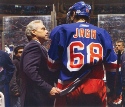
Canucks new home uni on Luongo/Naslund
****YOU DO NOT HAVE TO INSTALL THE CONTROLS IT ASKS IF YOU WANT TO..so don't bother"
Scroll down for the photos. Not a great job of the design. Not horrid though. I still think these are the right colors for Vancouver. Want to see road white though soon. It is out today...but no real photos other than these up anywhere yet.
Not bad, not great. Many hate the "VANCOUVER". Not sure what I think yet.
-
bruins72
- TBL Admin Team
- Posts: 14513
- Joined: Fri Jan 20, 2006 3:13 pm
- Custom Rank: Challenge Guy
- Favourite Team: Boston Bruins
- Location: Taunton, MA
-
batdad
- The Great One
- Posts: 12616
- Joined: Thu Aug 17, 2006 7:46 pm
- Custom Rank: Mr Technology
- Favourite Team: Syracuse Bulldogs.
- Location: Look behind you, you peon
-
B. Stinson

- TBL Admin Team
- Posts: 5131
- Joined: Mon May 08, 2006 11:22 pm
- Favourite Team: Philadelphia Flyers
- Location: Telford, PA
-
batdad
- The Great One
- Posts: 12616
- Joined: Thu Aug 17, 2006 7:46 pm
- Custom Rank: Mr Technology
- Favourite Team: Syracuse Bulldogs.
- Location: Look behind you, you peon