We have decided that the site could really do with being redesigned so that we can all get the most out of the site has to offer. The current design (which we named "XG") has been in use since August 2006. A lot has happened since that time (despite EHM being put on indefinite hiatus) and the site has really grown. I've been wanting to redesign the site for quite some time but have been hesitant because I was expecting interest in EHM and TBL to decline owing to SI Games ceasing to develop EHM. In fact, almost the opposite has happened with EHM and TBL being as popular as they have ever been - maybe even more so. I think this is largely thanks to things such as the Challenges and Lidas' fantastic roster updates. This, we think, justifies taking the time and the effort to redesign the site.
Before I start explaining the aims of the redesign, I want to explain why we've called it "XG2". When designing XG back in 2006 (development started in February 2006 and was completed and launched in August 2006) we decided to call it TBL: Next Generation. This name was shortened to Next-Gen and finally to XG (the X sounds a bit like "next"). Thus this new version is simply XG2. It's a lot easier to type "XG2" than having keep typing out "the new site design" - so that's the logic behind the odd name!
We have decided to redesign the site because the current design (i.e. XG) has evolved so much over the past three years. Although at first it felt cohesive, the rate at which XG has evolved and grown makes it feel more like a forum with some modules attached rather than a single cohesive site. One of the main aims of XG2 is to make the site feel as one again. We aim to make it a lot easier to add new features/pages to the site with XG2. You will see from our current header image, we only have enough room for 12 buttons. This makes it hard to add content without having to prioritise and replace buttons. This limitation with the navigation buttons means that some pages are not as accessible as they could be.
The site could really do with a facelift, too. The current design is based on phpbb2 (the forum software the site runs on) which is several years old (originally designed in 2001). Phpbb3, which was released in late 2007, makes phpbb2 look very dated. We have never upgraded to phpbb3 because it would mean losing almost all of the functions we've added to the site (e.g. the Challenge Stats section, Hall of Fame, TBL Points, Downloads Database). In fact, the site would return to just being a basic forum. Modifying phpbb3 to have all of the features of TBL would be extremely time consuming and it would not be possible to reinstall some of the functions we use.
So, in the process of redesigning the site, it seems right that we give it a new look as well. However, when doing so, we do not want to stray from the basic Blue Line theme. In other words, although the new layout will look sleeker and be easier to navigate, it's still going to look like TBL.
So what sort of features are we looking to add/remove/change? Here is a basic summary of the sorts of things we're looking to do (this is by no means a comprehensive list of everything):
General Layout & Navigation
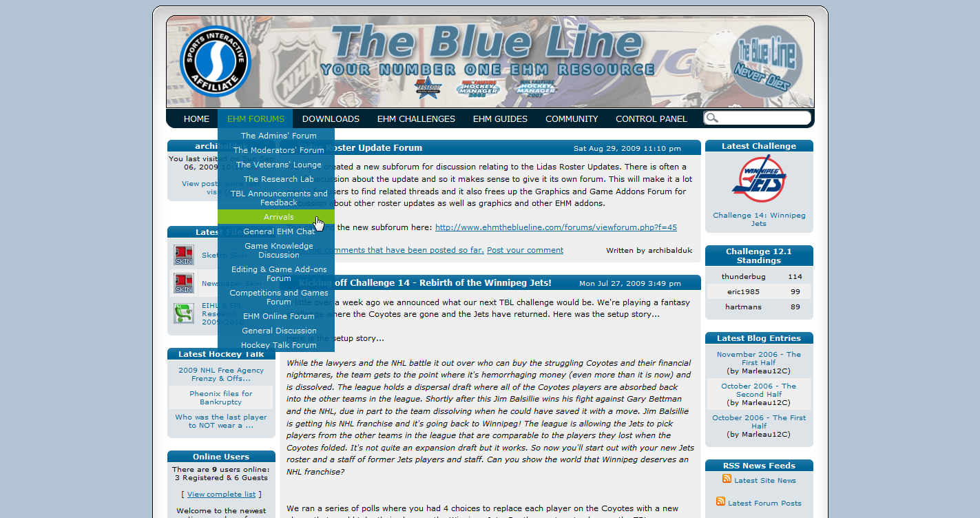
- Implement a drop-down menu system so that every section of the site can be accessed from it.
- Improve the Online EHM coverage of the site.
- Give the site a more contemporary look. Less clutter. However, the whole redesign must keep to our basic blue theme and use the same main blue colours.
- Remove the orange text that appears as headings on many forum pages.
- Make the site feel much more integrated and cohesive. At the moment, the site feels like a forum with modules attached to it.
- Make the search feature a lot more visible. Implement a search box into the navigation menu.
- Very long strings of text no longer make forum posts stretch too wide, breaking the layout.
- Make it so that unread posts remain with the unread icon until you actually read them. Currently, the topics lose their unread status after you first visit the site even if you haven't read the post. A number of users have requested this feature. Add the ability to mark posts as unread.
- At the moment, the site feels like a forum with modules attached to it. The Blog feels particularly isolated. The blogs need more coverage so that users are rewarded for using the blogs. Users would read blogs more if they could see what they were about.
- Make the Challenge Forum and other Challenge sections feel more integrated and less like bits added on to the forum.
- Improve the layout of the player stats page of the Challenge Stats and also the list of previous Challenges.
- Somehow link the blogs and the Challenges together. I think maybe we need some sort of "Challenge Central" page which would be the main page for the Challenges. It could have details of the latest Challenge and leaderboard (or just the top three) as well as useful links and info (latest rules changes, blog posts, forum posts, etc).
- Redesign the Home Page so that it is the main starting point for all users (both new and old) each time they visit the site. The basic features of the home page are great but I think more could be done to somehow attract users' attention to things like the Challenges and the Blogs.
- I was thinking we could display the latest Challenge leaderboard on the home page. Maybe just the top three or something like that?
- Navigation tabs on the Home Page so that a lot of info can be quickly and easily accessed. This will hopefully make the Home Page the first point of call when visiting TBL - regardless of whether the user is new or old (including Mods).
- Somehow make it easier for users to share their research for Lidas' rosters. This is such a big part of keeping EHM alive that we really need to better facilitate research. I'm not sure how we could do this. We could have a free-for-all forum so that all users can post updates (probably just transactions, retirements, etc rather than attribute changes) as well as the private forum we currently have. Maybe Lidas could tell us how we could help.
- The user details to the left of each forum post and the User Profiles are starting to look particularly cluttered where users have won a number of trophies.
- Possibly improve the trophies section. Could we use icons (gold, silver, and bronze trophy icons) with tooltips describing what each trophy was won for?
- Integrate FaceBook into the site. It's such a good way of users keeping in touch and reminding users who haven't visited in a while to come back and check us out. Just a link in each user profile on TBL to their FaceBook profile should do the trick.
- A more active rewards system sounds like a good idea of making things more interactive - and will hopefully encourage users to write blogs, guides, addons, etc. As B72 said, we don't get that many guides submitted but there's clearly users out there who would be capable of writing them. Users can give "thanks" to a useful post/file/blog/article. These "thanks" will contribute to the TBL Points system.
- Update the "About Us" page. Change it so that it's a forum post rather than a standalone page as this will allow us to update it much more easily.
- Perhaps remove the Image Gallery or at least reduce its use? It feels like a waste of server space especially when PhotoBucket, etc are much more effective.
- Make the Downloads section easier to navigate. Perhaps some sort of navigation tree at the top or side of each page so that users can quickly get from one section to another.
- Make the Knowledge Base and EHM Guide less like a forum and more like individual site pages.
- A facepack database. A searchable database of every single face pack so that users missing a face picture can find which face pack has the picture they want. I know I always find it a pain wondering how I can find which pack contains that one NHL player for whom I don't have a pic
The purpose of announcing this now is to get suggestions from anybody who wants to do so. We want to keep the TBL community involved in the redesign and so we encourage everybody to have their say.
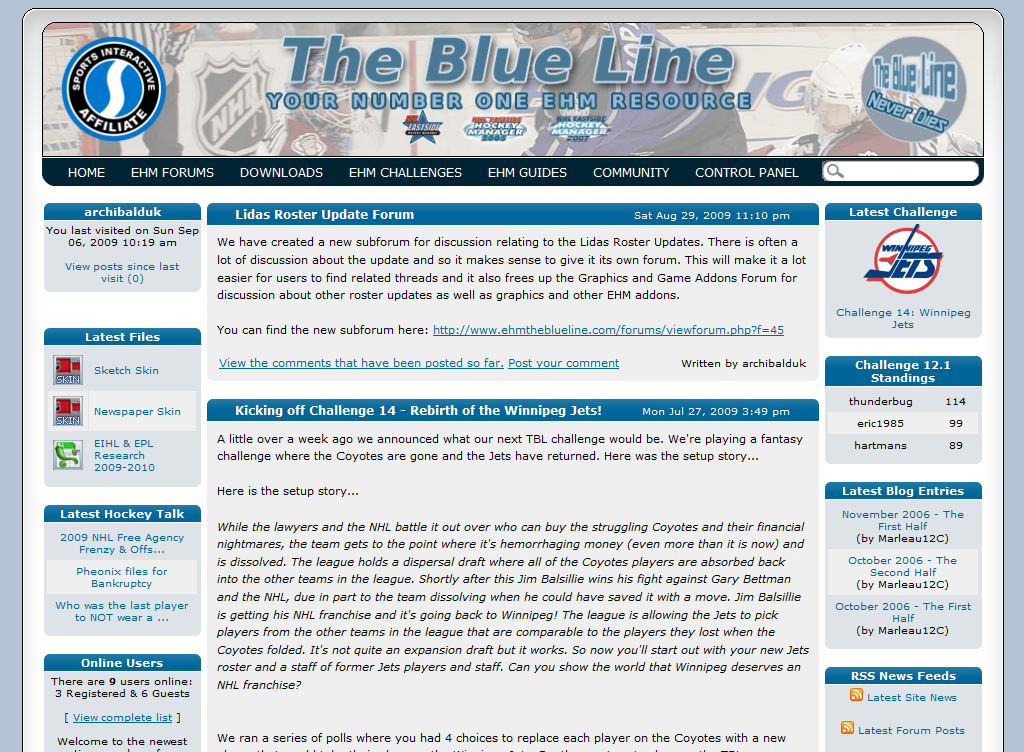
In the meantime, here is a sneak peek of how things are shaping up (note this is a very early design and it's far from complete):

I plan on posting relatively regular progress updates with screenshots as work progresses.